A short Android developer's guide on how to make responsive UI that makes both phone and tablet users happy. This is the companion blog post for my 10 minute presentation of the same title. There are code samples in the Example section of this post.
You can see the actual presentation here!
I want to highlight two things in this post: Modularity and Responsiveness. I think apps that keep both phone and tablet users in mind should have modular views/code and look good regardless of screen size.
Modular
Some views should be thought of individual modules: they should be able to stand on their own, or complement other views. Example: You're building a screen that is somewhat similar in functionality for both phone and tablet, but the tablet version has an extra view.
You can do two things 1) create an activity that works for phone, another for tablet, or better 2) create fragments for these two views, use the same 'modules' for tablet version.
This way, you can avoid copy-pasting the same code for your views.
Responsive
A responsive app means the app can present itself well regardless of orientation or screen size. As a programmer, you don't want to create different activities/fragments/views for different screen sizes. Instead, you want to write the same code and have Android do all the work for you.
Why It Makes Sense to Use Modular/Dynamic UI
Let's look at the similarities and differences between phones and tablets.
People typically use phones in portrait mode. Portrait is somewhat limited in screen real estate, but it works well for lists.
Tablets gain a lot more screen space when used in landscape mode. A tablet in landscape showing the same layout as if it were in portrait mode looks awkward. There's too much underutilized space! We could use that space to show more relevant information.
Phone users use one hand while navigating using their thumb, with the "sweet spots" located near the lower right corner of the screen. Tablet users vary. Sometimes they use two hands, one hand to hold the tablet, the other (forefinger) to navigate. Maybe they use one hand with the tablet laid flat on the table or docked at an angle. This tells us that locations of buttons, etc. on the phone may not work as well as on a tablet.
Phones and tablets share the same interaction paradigm. Users can swipe, tap, long press, etc. This is awesome, because this enables us to create a familiar experience for both users. We don't have to "teach" them how to use a tablet.
tl;dr - Users can perform the same actions, but you can show more data with a tablet in landscape mode. You might need to reposition stuff to help the user navigate the app better.
So.. now we're motivated to write a responsive app that works well on both phone and tablet! How do we do this on Android?
Android resources can be specified using qualifiers. Android loads the corresponding .xml resource based on declared qualifiers. Qualifiers are simple to get into, but could get quite complicated depending on usage.
To simplify this post, let's stick to using the smallest width qualifier (specifically, 600dp). This ensures that we will use a different layout whenever Android detects that there is at least 600dp available for either length or width of the screen.
Wait, why not check if the device is used horizontally (landscape mode)?
We care about showing the user more data / repositioning views when there is enough screen the app could use. Using land (landscape) as a qualifier only checks if the device is used horizontally. What if the device is actually 4:3, and landscape mode doesn't have as much screen space as we thought?
Consider the gif below. This is a tablet in landscape mode. If we used land as the qualifier for the "bigger" layout, the app would have been only displayed in the "bigger" layout. Instead, we let Android use the "smaller" layout if necessary by using the w600dp-land qualifier.
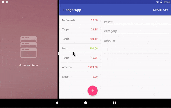
w600dp-land lets Android choose the bigger layout when there is at least 600dp width and if the device is in landscape. The bigger layout is commonly referred to as the Master-Detail Pattern.
Example
Let's look at this example from one of the open source projects I follow, Standard Notes. It has a generic user interface, making it easy for us to pick it apart.
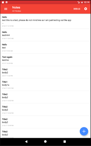
Here's a regular RecyclerView with a Floating Action Button (FAB). Let's call this screen the NotesListFragment. Upon clicking the FAB, it takes the user to the CreateNotesFragment screen. Let's refer to the "meat" of the window (white area w/ text below the toolbar) as R.id.main_content.
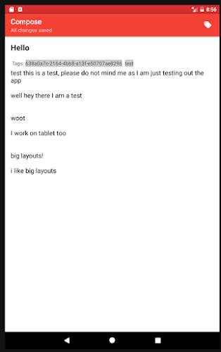
You can see there's nothing crazy here. I am simply using FragmentTransaction to add whatever is on R.id.main_content with our new CreateNotesFragment. I also used addToBackStack() so that when the user hits the back button, the user is brought back to the NotesListFragment.
supportFragmentManager
   .beginTransaction()
   .add(R.id.note_list_container, noteFragment, TAG_NOTE_FRAGMENT)
   .addToBackStack(null)
   .commit()
Let's call the Activity handling these Fragments as MainActivity, and it's corresponding layout activity_main.xml. activity_main.xml contains:
<Drawer layout + toolbar stuff..>
    <include layout="@layout/main_container" />
</closing tags>
And under layout/main_container.xml:
<FrameLayout
    android:id="@+id/note_list_container"
    xmlns:android="http://schemas.android.com/apk/res/android"
    xmlns:app="http://schemas.android.com/apk/res-auto"
    app:layout_behavior="@string/appbar_scrolling_view_behavior"
    android:layout_width="match_parent"
    android:layout_height="match_parent" />
So far, so good!
What about tablet/large landscape layouts? We can use the Master-Detail pattern for this!
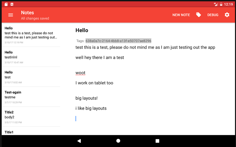
I created a new layout under the w600dp-land folder. Recall earlier that Android will load this layout when the w600dp-land criteria is met. All this new layout contains is:
<LinearLayout xmlns:android="http://schemas.android.com/apk/res/android"
    xmlns:app="http://schemas.android.com/apk/res-auto"
    android:orientation="horizontal"
    android:showDividers="middle"
    android:layout_width="match_parent"
    android:layout_height="match_parent">

    <FrameLayout
        android:id="@+id/note_list_container"
        app:layout_behavior="@string/appbar_scrolling_view_behavior"
        android:layout_weight="1"
        android:layout_width="0dp"
        android:layout_height="match_parent" />

    <FrameLayout
        android:id="@+id/note_container"
        android:layout_marginTop="?android:attr/actionBarSize"
        android:layout_weight="3"
        android:layout_width="0dp"
        android:layout_height="match_parent" />

</LinearLayout>
Again, nothing too crazy here. I am adding the NotesListFragment to R.id.note_list_container, and replacing CreateNotesFragment to R.id.note_container. (This is a simplified example. In the app I am doing a few checks for savedInstanceState, etc)
supportFragmentManager
    .beginTransaction()
    .add(R.id.note_list_container, noteListFragment, TAG_NOTE_LIST_FRAGMENT)
    .add(R.id.note_container, noteFragment, TAG_NOTE_FRAGMENT)
    .commit()
Phew! That was a lot. However, there's more :D
In the screenshots, the FAB in landscape disappears and turns into a MenuItem, with the text "New Note". Thankfully, qualifiers work on menu layouts as well! In this example, the NotesListFragment layout handles the FAB.
Let's refer to the NotesListFragment regular menu layout as menu_list.xml. This "menu" layout is left empty for our purposes.
but in menu-w600dp-land..
<menu xmlns:android="http://schemas.android.com/apk/res/android"
    xmlns:app="http://schemas.android.com/apk/res-auto">

    <item
        android:id="@+id/new_note"
        android:title="@string/new_note"
        android:orderInCategory="1"
        app:showAsAction="ifRoom" />
</menu>
We're adding a new menu item with the id new_note whenever the qualifier w600dp-land is met.
How will NotesListFragment know when New Note is clicked? There's quite a bit of boilerplate, but it's relatively short. We want to tell MainActivity that NotesListFragment has its own menu items, and we want to display it. NotesListFragment will also handle click events for New Notes.
Excuse my kotlin.
override fun onCreateView(-stuff-): View? {
    val view = inflater.inflate(R.layout.frag_note_list, container, false)
    setHasOptionsMenu(true)  // tell `MainActivity` to display this fragment's menu
    return view
}

override fun onCreateOptionsMenu(menu: Menu, inflater: MenuInflater) {
    inflater.inflate(R.menu.note_list, menu) // inflate this menu layout
    super.onCreateOptionsMenu(menu, inflater)
}

override fun onOptionsItemSelected(item: MenuItem?): Boolean {
    when (item?.itemId) {
         R.id.new_note -> startNewNote(selectedTagId) // handle click events for "New Notes'
    }
    return super.onOptionsItemSelected(item)
}
That's it for this example! There's more you can do to create dynamic layouts, but I can tackle that on a different post. I briefly pointed out some of these in my slides.